Central Health Branding & Logo Guidelines
The Foundation of Our Visual Identity
Our logo serves as the most immediate visual representation of who we are and what we stand for. Consistent and proper usage of our logo across all platforms is crucial in establishing a strong, unified brand presence. This section provides detailed guidelines on how to correctly use our logo in various contexts to ensure clarity, recognition, and impact. By adhering to these guidelines, we protect the integrity of our brand and maintain a cohesive visual identity across all touchpoints.
Logo is a general term used to reference any graphic that represents a company, organization, or brand. It is a visual mark designed to be easily recognizable and memorable. Logos are often composed of images, symbols, and/or text that convey the essence of the brand’s identity.
A brandmark is a specific type of logo that consists of a symbol, icon, or design element without any text. It visually represents a brand and is designed to be instantly recognizable and associated with the brand. Brandmarks are often used to create a strong visual identity that can stand alone and still convey the essence of the brand.
A wordmark is a logo that focuses on the brand name itself, using unique letterforms to create a memorable and distinctive visual identity. It emphasizes the name of the brand as the primary element of the logo.
A signature in branding typically refers to a logo arrangement and is comprised of a combination of brandmark, wordmark, and byline. Our logos have specific signatures detailed on the following pages. No signatures beyond those detailed herein have been approved for official use.
Logo Anatomy

Our System Brandmark


Our brandmark captures the essence of the Central Health system brand. It features our core palette, a combination of teals that evoke feelings of trust and healing. The design incorporates key elements of our identity:
- The “C” stands for “community,” “central,” “care,” and “connection.”
- The “H” stands for “health” and “heart.”
- The internationally recognized healthcare cross symbolizes unity, compassion, and care.
This brandmark is a visual embodiment of our commitment to providing comprehensive, inclusive, and high-quality healthcare.
The brandmark should always be surrounded by clear space that is equal to the width of the stem in the “H” element.
Central Health Signature
Primary Signature
The primary signature for Central Health consists of three components: brandmark, wordmark, and byline.
It can appear in a vertical configuration (with the wordmark and byline vertically centered below the brandmark) or in a horizontal configuration (with the wordmark and byline horizontally centered to the right of the brandmark).
The signature should always be surrounded by clear space that is equal to the height of the “C” from the wordmark.
Within the signature itself, spacing between the brandmark and wordmark should be equal to the height or width of the “C” from the wordmark.
Secondary Signature
The secondary signature for Central Health consists of two components: brandmark and wordmark.
This secondary signature follows the same clear space and internal spacing rules as the primary signature.


Download the Logos
Download a .zip file containing approved versions of the logo.
Our Core Palette

Primary Color Palette
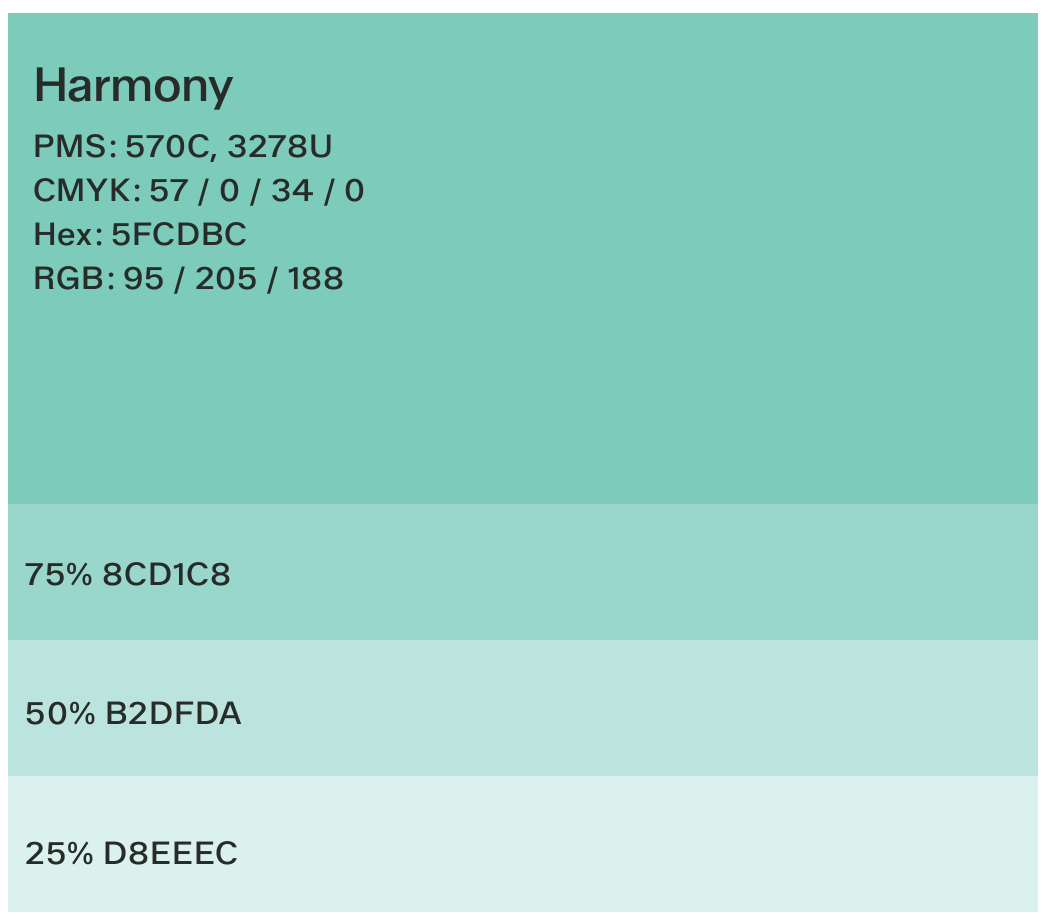
Our unique color palette helps distinguish our brand and makes it more memorable.
Our primary palette consists of a dyad of teals and warm neutrals. This combination evokes feelings of trust and healing while maintaining the visual integrity of our brand.
Each color within the palette can be adjusted in opacity, allowing for increased flexibility and versatility in its application.
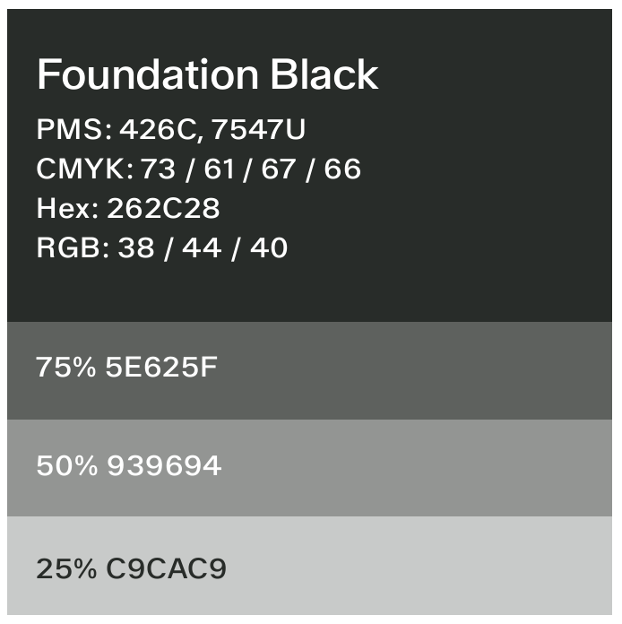


Neutral Color Palette
These neutral colors can be used to complement or balance virtually any of the brand primary and accent colors. They are useful for providing a foundation against which primary and accent colors can “pop” or be emphasized.
Our Accent Palette
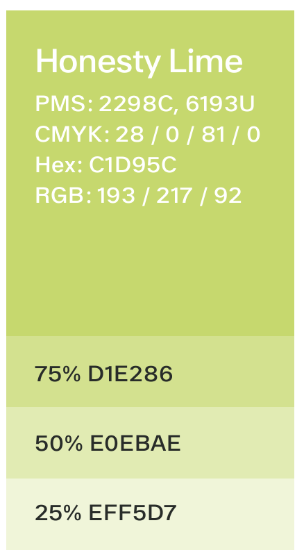
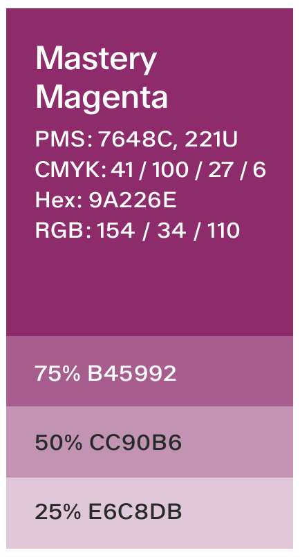
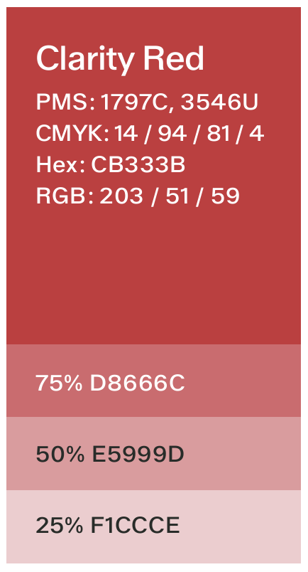
Accent colors play a significant role in a brand’s visual identity, complementing the core color palette and adding flexibility and depth to the brand’s overall appearance. Here are some key functions of accent colors:
- Highlighting information: Accent colors are used to draw attention to specific elements within a design, such as calls to action, links, buttons, or important text. This helps guide the viewer’s eye and emphasizes key information.
- Adding visual interest: Incorporating accent colors adds variety and richness to a brand’s visual materials helping to keep the designs engaging and prevents them from appearing monotonous or overly uniform.
- Supporting hierarchy: Accent colors help create a visual hierarchy by differentiating between primary and secondary information. They can be used to establish levels of importance and ensure that the most critical elements stand out.
- Expressing brand personality: While core colors establish the main brand identity, accent colors can convey additional aspects of the brand’s personality. For instance, an accent color might add a touch of vibrancy, playfulness, sophistication, or urgency to the brand’s visual communication.
- Supporting brand recognition: When used consistently, accent colors become part of the brand’s recognizable visual language. They contribute to overall brand recognition, even when used in small doses.
As the name implies, the colors within this palette are meant to be utilized as accents and used sparingly to highlight or draw attention to specific content. Accent colors should not be used in a ratio larger than any primary color within a design. All the colors can be adjusted in saturation to provide further versatility in their usage.
It is not recommended to use more than one accent color in a design.

